
Color of the Year 2021

Updated: Jan 4, 2022
“Amid uncertainty, people yearn for stability. The colors we surround ourselves with can have a powerful impact on our emotions and wellbeing,” - Andrea Magno, Benjamin Moore director of color marketing & development.

2020 has been such a turbulent year and everyone is looking forward to a more peaceful new year. If anyone has picked up on the need for calm in 2021 it's paint companies.
Looking at the new color of the year choices are that are coming out they capture the current moment in design, gathering insights from pop culture, fashion, architecture, and technology trends which right now are all rooted in balance and tranquility.
Today I am going to focus on my two favorite paint companies that I use for myself and our clients time after time, Benjamin Moore and Sherwin-Williams.

Aegean Teal by Benjamin Moore
Benjamin Moore has selected Aegean Teal 2136-40 for its 2021 color of the year. It is a lovey shade of blue-green with grey undertones. The color's calming qualities make it a great choice for use in bedrooms or home offices. Where I have seen it lately is in kitchen cabinetry or built-ins. Like in the photo above it lends itself well with natural materials like wood, stone, and brick to give it a sence of warmth and texture.

Benjamin Moore's 2021 color trends palette is made up of 12 organic hues from soft buttery yellows and creamy off-whites to deep earthy hues that pair beautifully with each other.

Urbane Bronze by Sherwin-Williams
″The home is now the ultimate retreat from the world, and color is an easy and effective way to create a personal haven,″ -Sue Wadden, Sherwin-Williams director of color marketing.
Sherwin-Williams selected Urbane Bronze SW 7048 for its 2021 color of the year. It is a bold warm shade of gray-brown that gives me a strong burnished metal vibe. If you are so daring it would be a very sofisticated statement on all 4 walls in a bedroom or den. It can also be used for kitchen cabinetry, built-ins, and doors with walls painted in a warm white like Pure White SW 7005 to offset the darkness and give it a crisp contemporary look like in the photo above. Pair it with natural materials like wood, stone, leather, woven texures and metals to bring out that orgainic feel.
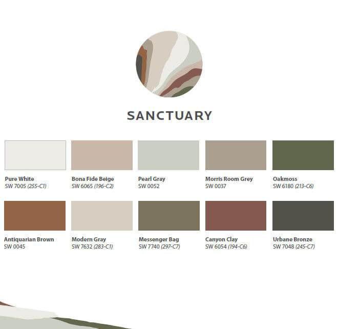
Sherwin-Williams Colormix Forecast 2021 is made up of 40 trend colors, presented in four palettes: Sanctuary, Encounter, Continuum, Tapestry. The Sanctuary palette holds 10 nature inspired colors ranging from warm whites and soft grays to more jewel colored greens and browns that when combined together hug the room with a nurturing effect.

How to use a Color of the Year in your home
Just because you like a color does not mean that it has to go on the walls. There are many ways to incorporate color into your space. a front door, cabinetry, a kitchen island, shelves or a bookcase, wallcoverings, furniture, ceilings, trim and baseboards, accessories, fabrics, or in a rug.
If you are nervous about trying a new color test in small doses with things like accessories, art, or pillows before you go all in with larger areas or pieces. In the end the colors that you choose should not be anything someone tells you to use because they are currently the trendy color. They should be colors YOU enjoy and bring YOU happiness every time you look at them. Making a color change in your home is the biggest change you can make for your decorating budget. Here are some of our top tips for creating a new color palette:
Color don’ts
• Rush to make a decision
• Pick color from a tiny swatch at the paint store or test the color on your own walls (lighting is everything for paint colors)
• Think only about the room that you are painting. Color needs to flow in order to work.
Color do's
• Create a color palette and work from there. Think about everything in your room currently, what you want to keep vs replace.
• Buy the best quality paint you can afford. Our preferred paint for the average home owner is Dutch Boy Platinum Plus it is affordable and has a ton of pigment making the application one and done. (remember you can always match colors to whatever paint you want to use)
• Can't decide on a color? Look at magazines, Pinterest and your own wardrobe for inspiration
When all else fails, call a professional. Our job is to keep you from making mistakes and help you find a color palette that you absolutely love.
Other posts you might enjoy:


https://soicauxsmb.com/ bữa thấy bạn bè nhắc nhiều quá nên mình cũng ghé thử cho biết. Mình không đọc sâu đâu, chủ yếu lướt nhanh xem họ làm giao diện ra sao thôi. Vừa vào là thấy trang nhìn khá sáng sủa, không bị rối mắt, kéo xuống cũng dễ theo dõi. Mình để ý cách họ chia nội dung theo từng khối rõ ràng nên nhìn phát là biết chỗ nào đang nói gì, khỏi phải dò từng dòng. Với lại mấy phần số liệu họ để dạng bảng/cột gọn gàng, nhìn nhanh vẫn nắm được ý chính. Mình thích kiểu bố cục này vì lướt trên điện thoại cũng không bị “ngợp”, các khung thông tin và bảng hiển…
sunwin mình ghé qua thử cho biết vì thấy bạn bè nhắc hoài, chứ cũng không định mò sâu. Vừa vào là thấy họ làm bố cục kiểu chia khối rõ ràng, nhìn phát hiểu ngay chỗ nào là mục chính, chỗ nào là thông tin phụ, nên lướt khá nhanh. Mình hay khó chịu mấy trang nhồi chữ, nhưng ở đây chữ vừa phải, khoảng trắng ổn nên mắt đỡ mệt. Thử kéo lên kéo xuống với bấm đổi mục vài lần thì thấy phản hồi khá mượt, nhất là trên điện thoại, không bị giật hay load lâu. Nói chung cảm giác như họ ưu tiên cho người mới vào khỏi bị rối, kiểu mở ra là biết…
https://soicau247.com/soi-cau-lo-de-chuan-xsmb.html hôm trước mình lướt thấy link này nên bấm vào xem thử cho biết thôi. Mình không kiểu ngồi đọc hết từng dòng, chủ yếu nhìn xem trang họ trình bày có dễ theo dõi không. Vào cái là thấy họ chia nội dung theo từng khối khá rõ, lướt xuống không bị rối mắt. Có cái mục lục ở đầu nên muốn nhảy nhanh tới phần mình quan tâm cũng tiện, khỏi phải kéo tìm mỏi tay. Mấy đoạn số liệu/bảng nhìn gọn gàng, chữ vừa phải, không bị dính chùm vào nhau. Nói chung cảm giác dùng ổn, kiểu xem nhanh cũng nắm được mình đang ở phần nào nhờ các tiêu đề và khối nội dung…