
2023 Color Trends
- Alushia Fitzgerald

- Jan 20, 2023
- 7 min read
Updated: Jan 30, 2023

Each fall, paint companies and interior design experts predict the colors that will shape our homes in the coming year. So here is a round up of what is to come for color trends in 2023.
While 2022 colors were centered around shades of green, 2023 is all about
self-expression.
PANTONE Viva Magenta 18-1750

Let's start with the tastemaker, Pantone. They have selected Viva Magenta 18-1750, an electric warm pinkish red for their color of the year.
The bold color choice is definitely not for the color-shy. “In this age of technology, we look to draw inspiration from nature and what is real,” says Leatrice Eiseman, executive director of the Pantone Color Institute, in a statement accompanying Pantone’s Color of the Year 2023 announcement. “Pantone 18-1750 Viva Magenta descends from the red family, and is inspired by the red of cochineal, one of the most precious dyes belonging to the natural dye family as well as one of the strongest and brightest the world has known.”
Whether it’s used as a paint color on the wall or a pop of color in furniture, décor or art this Color of the Year 2023 selection is intended to spark creativity and self-expression. As part of the announcement, Pantone also revealed the “Magentaverse,” a set of eight colors (including Viva Magenta) that complement Viva Magenta best:

Pale Dogwood, PANTONE 13-1404
Gray Sand, PANTONE 13-1010
Gray Lilac, PANTONE 13-3804
Pale Khaki, PANTONE 15-1216
Fields of Rye, PANTONE 15-1115
Agate Gray, PANTONE 15-6307
Plein Air, PANTONE 13-4111
These additional colors lean neutral, a good reminder that a strong color like Viva Magenta will work best when paired with less bold colors.
BENJAMIN MOORE Raspberry Blush 2008-30
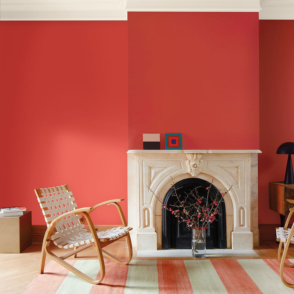
Bright and cheery, Benjamin Moore's pick for 2023 color of the year is a vibrant red-orange called Raspberry Blush. The saturated shade energizes a room for a lively look that's anything but timid. “People are ready to bring color back into the home, taking a step outside their color comfort zones,” said Andrea Magno, color marketing and development director at Benjamin Moore, in a press release. “Raspberry Blush 2008-30 and the Color Trends 2023 palette empower the use of statement colors that deliver delight and personality while transforming rooms for incredible results."

For a maximalist approach, paint Raspberry Blush on walls, trim, and the ceiling to wrap a room in warmth. Or go for a smaller statement on a piece of furniture or in pillows or drapery. Like with other bold colors soft shades of white and beige or other more neutral colors will balance the bright, cold hue.
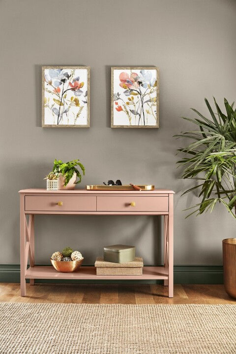
SHERWIN-WILLIAMS Redend Point SW9081

A blend of blush and beige, Redend Point by Sherwin-Williams features subtle muted pink undertones to warm up walls. The grounding shade feels especially on trend as homeowners are turning toward more earth tones to bring comfort and joy to their interior spaces. "People have been drawn to nature-inspired and earthy tones the past couple years, and this is something that will continue into 2023 and beyond," says Sue Wadden, director of color marketing at Sherwin-Williams. "Greens, blues, and browns can make any space feel safe, calming, and grounded yet still energized." You can showcase Redend Point in an entryway or in a nook for a cozy welcoming vibe. To create an eye-catching focal point use it on a bathroom vanity or piece of furniture.
To me it screams desert boho vibes, especially when you see it with the coordinating color palette.

Now that we've covered the big 3 and their color predictions here are additional paint companies choices for 2023.
KRYLON Spanish Moss

Green is quickly becoming the new neutral as homeowners opt for comforting colors in lieu of the crisp, bright whites of decades past. So for its 2023 color of the year, Krylon selected Spanish Moss, a deep forest green that nods to nature.
"This midnight green has a strong connection with the richness of nature, dense forests, and mossy terrains. Rooted in the renewing power of green, it can balance with both warm and cool accents," said Ashley Banbury, senior color designer for Krylon, in a press release. The spray paint shade easily upgrades furniture and décor, plus plays well with practically everything. Pair the rich green with complementary colors like gold, sandstone, and copper to round out that nature inspired look. DUNN-EDWARDS Terra Rosa DE5096

As you will see several companies have chosen soft, earthy shades of pink and clay to take the lead as the most popular paint colors for 2023 and Dunn-Edwards is one of them with their choice of Terra Rosa. This shade blends brown and burgundy together for a rosy pink that works as both a grounding neutral and a delicate accent. “We’re putting health and wellbeing first, making time for escapism and embracing nostalgia ... This translates to design through lush, sophisticated touches with equal parts prettiness and drama," said Sara McLean, color expert and stylist for Dunn-Edwards. Sweet and cozy without being excessively cute, the warm hue adds comfort to a bedroom or living space. BETTER HOMES & GARDENS Canyon Ridge

Reminiscent of Southwestern landscapes, Canyon Ridge is an orange-meets-pink paint color that acts as a near-neutral when applied to walls.
The trendy spin on terra-cotta couples well with bright blue, to brighten it and make it feel less muddied. "Cobalt has vibrancy that makes this classic pairing feel modern," says BHG style director Jessica Thomas. "Rustic rooms may call for darker denim blue accents. For traditional décor, make it navy."
BEHR Blank Canvas

Not every 2023 color of the year has gone with a bold statement color. Blank Canvas, Behr's pick, is a creamy shade of white that goes with practically everything. The warm neutral stands out from the icy modern hues popular in the past. "Blank Canvas effortlessly offers a clean and inviting blank slate that allows individuality and creativity to flow freely. This white easily harmonizes with a wide range of hues, including neutrals, earth tones, and pastels for a charming and cozy appeal," said Erika Woelfel, vice president of color and creative services at Behr, in a press release. GLIDDEN BY PPG Vining Ivy

Vining Ivy blends blue and green for a tranquil backdrop. The color works well with both contemporary and classic styles. "[Vining Ivy] is energizing yet grounding, and it works in literally any space," said Ashley McCollum, Glidden color expert, in a press release. "Its versatility takes the guesswork out of design, leaving consumers with more time to indulge in the things that matter most to them." Pair the blue-green jewel color with wood finishes, stone accents, and rich textures for a room that nods to outdoors. I really like it paired with mustard yellows and gold.
DUTCH BOY Rustic Greige
This 2023 color of the year is a blend of gray and beige with subtle red undertones that pair well with today's trending earth tone paint colors. If you've been wanting that move from beige to mushroom this is your color. "The importance of overall well-being remains a primary focus in everyday lives," said Ashley Banbury, Dutch Boy senior color designer, in a press release. "That's why more DIYers are dedicating time and energy to designing personal spaces that make them feel cozy, protected, and calm." The color grounds three color custom palettes—Plush, Wistful, and Botanic—which showcase the neutral's versatility. VALSPAR 2023 Colors of the Year
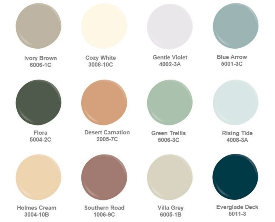
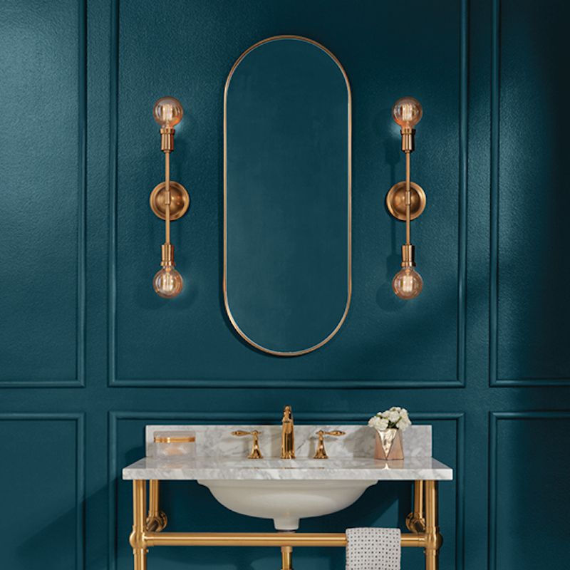
Valspar again has forgone selecting just one color for their color of the year and instead have chosen a pallet of 12 colors, including soft neutrals, sweet pastels, and soothing shades of blue and green. "[They] are usable shades that encourage self-expression and anyone can envision in their space," said Sue Kim, Valspar color marketing manager, in a press release.
My favorite out of the pallet has to be Everglade Deck. This color pairs well with wood and brass tones to create the perfect moody space.
The collection launched alongside Valspar's "Color-Verse," a virtual home that allows consumers to try out the 2023 colors of the year before you commit to anything in your own home.
In other color related news Farrow & Ball released 11 new paint colors in September!
While new paint colors are regular occurrences for many paint brands, this is huge for Farrow & Ball—the company hasn’t announced a new paint color in four years.
Farrow & Ball is known for its carefully curated palette of 132 rich paint colors. With the announcement that they were adding 11 new colors to that list (and archiving 11 older colors to make room for them), you can expect that these shades are perfectly developed to expand the base palette—and safely assume that these colors have been worth the wait.
“Our relationship with our home has changed so much over the last few years, it felt like the perfect time to introduce these new colours,” said Joa Studholme, color curator for Farrow & Ball, in a press release announcing the launch. “We all feel ready to show off our spaces and personal style.”
Studholme created the palette in collaboration with Charlotte Cosby, head of creative at Farrow & Ball. The new shades range from an earthy gray to a clean, forest green, all with the same depth of color and rich pigmentation that Farrow & Ball is known for.
The new Farrow & Ball colors are:

While the selection of colors in this new set is rather broad, all fit neatly within Farrow & Ball’s preexisting palette. Many of these new colors are intended to fit neatly between the older ones. “Our palette is made even more relevant through the introduction of these gentle lights and dramatic and atmospheric darks,” Studholme’s statement reads.
In addition to the new colors they also have a Virtual Home that allows you a tour of a home containing rooms decked out in all 11 colors.
FINAL THOUGHTS
In the 80's the average first-time home buyer would stay in their home for an average of 5 years. Now (if you are lucky enough to own your own home) first-time home buyers plan to stay put for an average of 10 years and repeat buyers for an average of 15 years.
Thinking long term means homeowners feel freer to create customized spaces that suit them continuing a shift away from one-size-fits-all styles in favor of approaches that celebrate personal taste and preference. Customized media rooms, libraries, pet incorporated customizations like feeding and bathing stations, and smart home technology are just a few non standard options homeowners are opting for across the generations.
What does this all have to do with color trends you may be thinking? I want you to look at these colors as just that...trends. See a color here that you love, incorporate it however you deem fit. Don't see anything that floats your boat, no worries you don't have to use it in your home.
Your home should be a reflection of you and how you live. Yes, when you get ready to sell that home what you have loved may not be what someone else loves but that is when prepping and home staging come into play to widen your potential buyer base. We have a whole blog post about that process here. Until then enjoy your space and if you need help creating a space that is a reflection of you we are here to make that happen.


Comments