
Design Trends for 2019
- Alushia Fitzgerald

- Dec 29, 2018
- 4 min read
Updated: Dec 22, 2021
With the New Year upon us many of us are looking forward to a fresh start and ways to improve ourselves. The New Year in the design world means new trends are in and over used, outdated trends are out. Here is a list I've complied from the experts of what is going to be "in" for 2019.
Color of the Year
Every year, several color forecasting organizations and paint companies predict the shades that will dominate in the following year, these colors then influence the home decor, fashion and automobile industries. Think of it like the Oscars for the interior design world.
Night Watch 1145-7
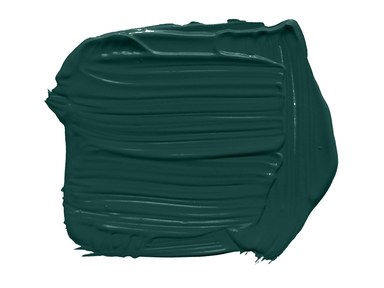
Paint company PPG was first out the gate this year to name their color of the year, Night Watch, "a rich, luxurious, and classic shade of green that reflects consumers’ urge to reconnect with nature in today’s tumultuous society."
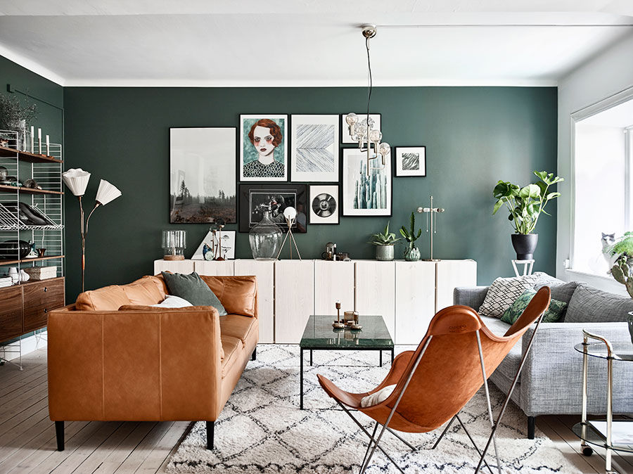
I have to admit I am OBSESSED with this color! So much in fact that I have seriously considered repainting some rooms in my house this color even though it was just repainted in August. White will pop this color keeping it fresh and dramatic while warm metals like copper and brass, medium warm wood tones and caramel leathers will only add to how handsome this color is. Not bold enough to coat your walls, try it out with some accent pieces or decor items.
Living Coral 16-1546
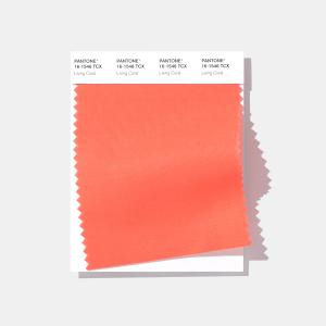
You can't talk about the color of the year without talking about Pantone they are the the most valued opinion when it comes to naming color trends and this year they have elected, Living Coral, "vibrant, yet mellow Living Coral embraces us with warmth and nourishment to provide comfort and buoyancy in our continually shifting environment."
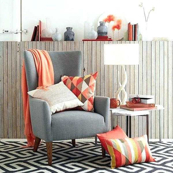
This color always makes me think of the sunny tropics. This color will go fantastically with cool grays, blues, blue-greens, terracotta earth tones, or hot pink. If you are painting in on walls go with white trim and lighter tone woods or white washed woods for floors or furniture. Again this is a bold color choice so if you can't bring yourself to go all in start with incorporating it in some accent decor pieces and graduate from there.
Metropolitan AF-690
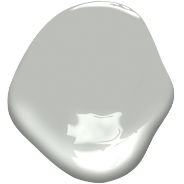
The color announcement that I always am excited for is from Benjamin Moore. I have been a huge fan of theirs since I started my interior design degree (way back in 2001). This year they have selected Metropolitan, "comforting, composed and effortlessly sophisticated, Metropolitan exudes beauty and balance."
I am just in love with this neutral. If you haven't figured it out yet I am a big advocate of painting the walls in your home a great neutral to allow you to change up your accent colors with ease and Metropolitan is one of those neutrals that would be perfect throughout your home.
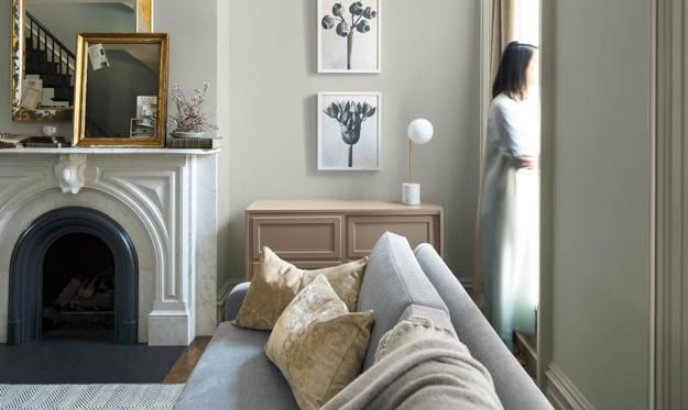
Paint out your trim in Decorator's White OC-149 for a clean pop and pair it with Kendall Charcoal HC-166, Beau Green 2054-20, Hunter Green 2041-10, or Hale Navy HC-154 for sophisticated drama.
If you want to embrace that relaxing calmness of the color pair it with Smoke 2122-40, Black Pepper 2130-40, Soft Fern 2144-40, Head Over Heels AF-250, or Pashmina AF-100.
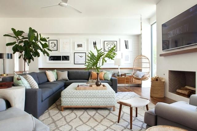
Home Decor Trends
-Patterns
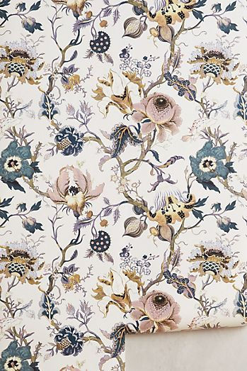
Floral Fabrics + Wallpapers: Either in abstract or chintz
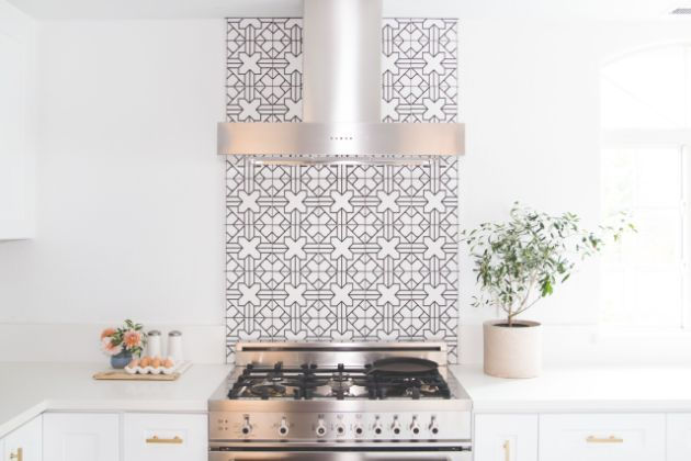
Boldly Patterned Backsplashes: either in a bold color or graphic tile
-Materials
Mixed Metal Accents: Stick to 2-3 different metals throughout a room. Brass, gold or nickel mixes well with either oil-rubbed bronze or aged iron. Silver or pewter mixes well with bronze and black brown metals.

Light Wood Floors: Think shades of birch, knotty alder, beachy white and light oak to evoke a more airy open look.

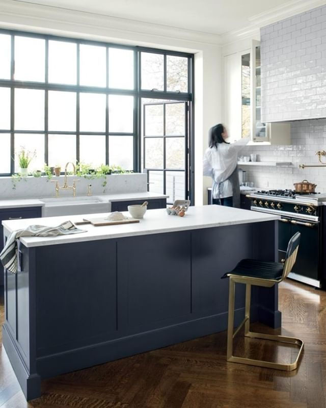
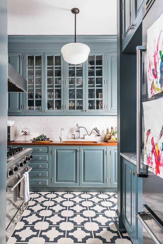
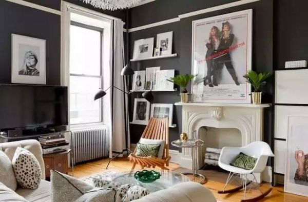
Painted Kitchen Cabinets: This trend will be great for both modern + traditional kitchens. Colors of choice are deep blues, greens, grays and black (go with a matte finish for extra design points).
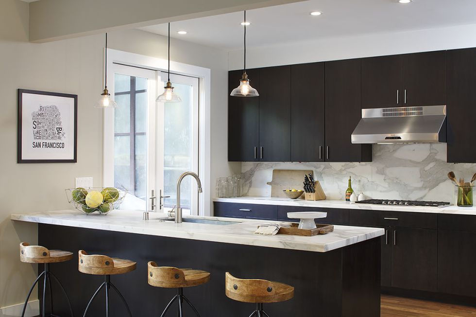
Warmer + Darker Kitchen Countertops: While marble will always be a classic this year things are leaning more toward darker tone woods and warmer-based stones instead of the stark whites and grays.
-Furniture
Four-Poster or Canopy Beds: Make sure you have the ceiling height to pull this off.

Acrylic or Lucite Furniture: These pieces are great for small spaces as they give a room architectural structure without taking up visible space.
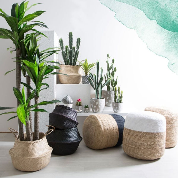
Handmade Pieces: Think sustainable materials like jute, rice paper, rattan, bamboo.
-Room Design
Statement Ceilings: With the accent wall out people are looking up for their pop of interest. Think molding covered, lacquered, wallpapered, or boldly painted.

Mostly White with a Hint of Color: Think 90/10 for this. Create a foundation of layers of white and then add your pop of color here and there.

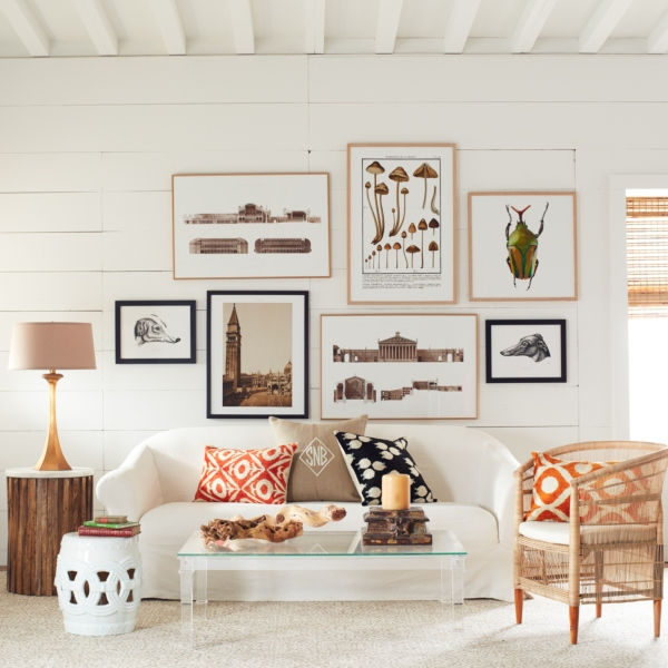
Eclectic: Designers are tired of seeing entire rooms all in the same style of furnishings (I really think the Mod look is what did everyone in). Think instead of vintage with a twist carefully curated from finds found traveling or pieces that just speak to you. You're going to see a shift to softer lines and curved furnishings as well.
Tell us what trends you're into this year or better yet share your photos with us...we'd love to see how you incorporate these design trends in your own spaces.
Other posts you might enjoy:
#designtrends2019 #interiordesign #interiordesigntrends #homedecortrends #coloroftheyear2019 #homedecor #paintcolors #kitchencabinets #kitchencountertops #woodfloors #handmadepieces #floralfabric #floralwallpaper #statementceiling #patternedbacksplash #acrylicfurniture #mixedmetals #whiterooms #boldcolors


Comments